


The 19.01 is a watch that’s all about transparency: the case is essentially nothing more than two, deep box sapphire crystals held together by a metal band that also happens to hold the strap mounting points. It’s the minimum thickness required for rigidity without spacers, attachment hard points for dial and movement, screw threads for front and back bezels and gaskets - that’s all. The rest is sapphire. Some concern has been expressed over sapphire’s brittleness: it’s a hard (i.e. difficult to scratch) material, but can shatter if hit wrongly, especially with a sharp point. This is why the deep box crystals have curved bevels, both inside and outside, to dissipate stresses. They are very slightly domed for even more strength, and failing that - are a hefty 1.5mm thick. A large area of sapphire allows the movement to be seen from all sides, including the gear train thanks to skeletonization of the bridges.
We carried this design principle through to the dial, too: the baseplate of the movement (and thus, dial side) are solid because it really isn’t very attractive to see your wrist through the watch. It carries the same finish as the rest of the movement, and an interesting geometry as the same baseplate layout is used for other variants of the movement with different functionality. Rather than repeat the digital guilloche of the 17-series, or have a plain dial, we elected to show it off. Normal smoked sapphire was considered, but dismissed as legibility in the middle portion of the dial tends to be a bit compromised.
A fully opaque surface would help with legibility, but the transition would either be very abrupt and create some visual balance issues especially around the lengths of the minute and hour hands, and a graduated pattern might land up dominating the subtle movement details. The inspiration for the gradient dial actually came from two sources: traditional enamel dials, with their extremely deep but reflective lustre, and the radial graduated neutral density filters that I use for certain types of photography to compensate exposure for very wide angle lenses.
It turned out that the process of making the dial was a lot more complicated than expected: countless dial blanks and four suppliers were rejected because the gradient was not perfectly continuous, the colours were wrong, or the process required dithering. In the end, our suppliers developed an entirely new process for creating our dials - along with the tooling and protocol to go along with it. In simple terms, the dials are secured a fixed distance from a precise nozzle that sprays paint of a controlled viscosity at a controlled pressure for a controlled duration; the paint mist creates the gradient effect. It is applied to the reverse (movement-facing) side of the dial, and the dial is not anti-reflective coated: this is deliberate because it is desirable to see a bit of reflection off the dial face to evoke the deep gloss of enamel. The end result is a dial that has an extreme depth of color - a bit like a tropical ocean sinkhole - but with complete transparency at the edges, and a clearly defined surface.
By comparison, our hands are a little more conventional - planar, finely bead blasted and filled with Superluminova X1, they are distinctive and very similar in outline to the 17.01’s hands, establishing the family resemblance. They are also skeletonized with a clean design to match the aesthetic of the bridges.
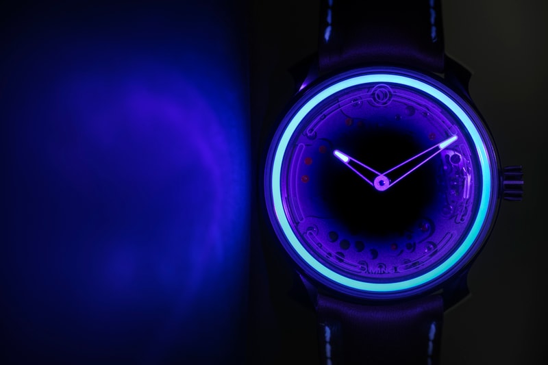
Though luminous markers on the dial or on the movement top plate (or even on the underside of the sapphire crystal) would also have allowed easy reading of time, they wouldn’t be as interesting as the ring applied to the inside of the front bezel. The circular motif is a key part of our design language as it represents both visual symmetry and balance, as well as the continuous nature of time. However, the addition of the luminous ring does more than that: it also creates a distinctive nighttime signature as well as a very bright and long-lived internal light source that does interesting things against the outer crystal, especially when viewed from an angle.
What you see in the feature image for this post is the watch illuminated with a UV source: yes, there’s some purple glow from the visible component, but for the most part, it demonstrates how even the application of luminous material is - that’s because the layers are thick, but more importantly, the hands are deliberately more intense than the outer ring so reading of time remains instinctive and one picks up the correct elements first.
The 19.01 is a watch that challenges design and production on many levels: it was our intention and challenge to ensure that it always looks good, regardless of the ambient lighting conditions.
- MT

